Follow Us On:
Changing the way you think About Data
the Power of Visual Analytics.
Dashboards offer several advantages over traditional PowerPoint (PPT) or PDF reports, providing a more dynamic and interactive approach to data visualization. Here are some key benefits of using dashboards:
01
Highly Interactive
Enable users to interact with the data, drill down into specific details, uncovering insights that may not be immediately apparent in static reports
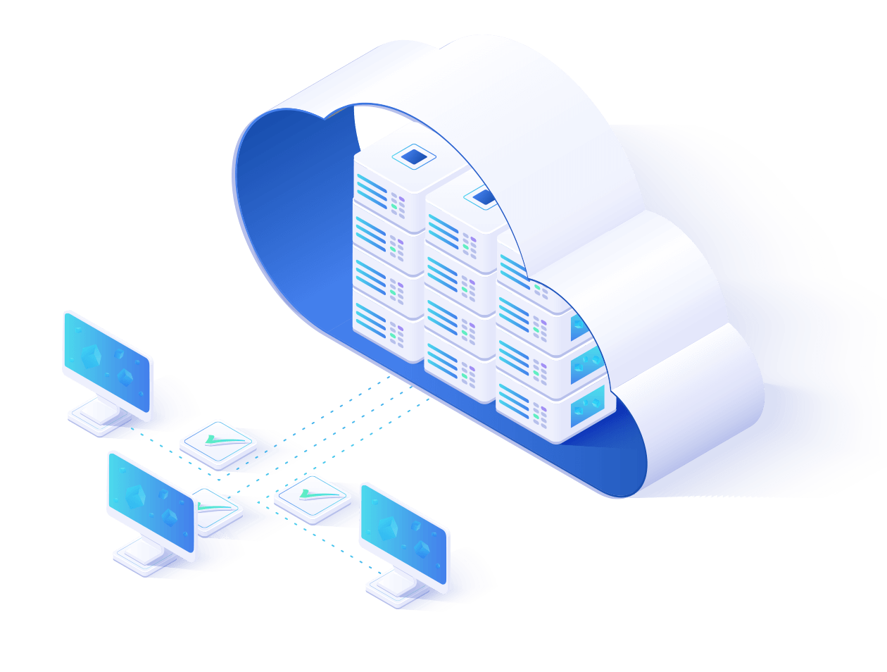
Can pull data from various sources, providing a holistic view, enabling it to be part of a connected data ecosystem, enhancing overall business intelligence
Provide a more efficient way to users to navigate through large reports, focusing on KPIs and critical metrics, enabling quick assessments of overall performance
Allowing users to access the latest data make informed decisions early without waiting for manual report generation using real-time or near-real-time updates
Define the scope of the project, emphasizing specific deliverables
Align project goals with end-user expectations
Establish a preliminary project timeline
Discuss technology considerations and preference
Establish an open channel for ongoing communication
Data Gathering Preparation and Brainstorming
Discussion on the questionnaire and data structure, study segmentation, and target outcomes
Identifying preferences for dashboard structure, color palette, fonts, and logos
Gather raw data structure and detailed analysis plans based on study requirements
Dashboard Development
Devloping script to transform the raw data into structured (that dashboard tool understands/expect)
Devloping data model to accomodate additional calculations and data filtering
Creating charts and graphs based on analysis plans
Building the actual dashboard structure using mockups as a guide
Applying design preferences, including color schema and fonts
Share the initial dashboard draft with the stakeholder/client for review
Client Feedback and Iteration
Gather feedback on usability, accuracy, and design.
Conduct multiple discussions to refine the dashboard model, schema, and design.
Ensure alignment with client expectations and project objectives
Reaching consensus on design elements and visual aesthetics
Final Review, Update, Presentation and Distribution
Receiving the finalized data set from clients/stakeholders
Updating the dashboard to reflect the latest information
Addressing any last-minute adjustments or refinements to ensure coherence with the updated data
Delivering/hosting final dashboard on confirmation from client/stakeholder
Feartures
Highly Interactive
dashboards leverage dynamic filters, cross interaction, and informative tooltips to empower users with interactive tools for data exploration. These features not only enable a more personalized and in-depth analysis but also reveal nuanced insights that may remain hidden in static reports.
Dashboards allow users to implement dynamic filters, enabling them to interactively refine the displayed data based on specific criteria or parameters.
Users can easily explore data subsets by adjusting filters, providing a customized view that aligns with their specific analysis or reporting needs.
Dashboards facilitate cross-interaction between different visual elements, allowing users to see how changes in one part of the visualization impact other related components.
Cross-interaction enhances the holistic understanding of data relationships, enabling users to identify correlations and dependencies that may be overlooked in static reports.
Dashboards often incorporate informative tooltips that provide additional context or details when users hover over specific data points or visual elements.
Tooltips enhance the user experience by offering on-the-fly insights, allowing users to glean more information without cluttering the main visualization, fostering a more efficient analysis process.
Features
Customizable
Dashboards allow the inclusion of content that caters specifically to the information needs of different audiences. Whether it’s presenting financial data for executives or operational metrics for front-line teams, the dashboard can be configured to deliver the most meaningful insights to each audience segment
Role-Based Personalization (Relevant Data)
Users can customize their dashboard based on their roles, ensuring that individuals with different responsibilities have access to information pertinent to their functions
Role-based Personal. (Customized Views)
Dashboards enable the creation of tailored views that cater to the specific needs and preferences of different user groups within an organization
Fetaures
Adaptable to Changes
Faff about only a quid blower I don’t want no agro bleeding chimney pot burke tosser cras nice one boot fanny.!
Data visualization tools offer a high degree of agility, allowing users to easily update or modify reports and dashboards in response to changes in data sources, evolving business requirements, or emerging trends
Users can make seamless modifications to visualizations, ensuring that the reports remain relevant and aligned with the dynamic nature of the business landscape
The flexibility to accommodate changes ensures that reports and dashboards are future-proof, capable of evolving alongside the business and technological advancements without significant disruption
Dashboards can be adjusted in real-time, enabling organizations to respond swiftly to changes in data structures, metric definitions, or the introduction of new business parameters
Features
Faster Data Exploration
Provide a more efficient way to users to navigate through large reports, focusing on KPIs and critical metrics, enabling quick assessments of overall performance
Efficient Navigation
Allowing users to easily move through large reports without the need to sift through pages or sections.
Focus on KPIs and Critical Metrics
Presents KPIs & critical metrics - eliminates the need for users to search for info within extensive reports
Assessments of Overall Performance
Instantly accessing and interpreting the highlighted KPIs and critical metrics - accelerating decision-making and response times.
Features
Data Blending and Integration
Long established fact that a reader will be distracted by the readable content of a page when looking at its layout.
Connectivity to Diverse Data Sources
Enables users to pull in data from various systems, ensuring a holistic representation of information
Data Modeling and Schema Design
Allows users to define relationships and hierarchies in the data enabling complex and insightful visuals
Features
Fast Almost Real-Time Data
Unlocking Analytical Efficiency
In data analysis, analysts often spend up to 40% of project time crafting reports in PowerPoint or Word, diverting focus from core analysis. Traditional reporting, done post-data receipt, leads to delays, especially in quarterly reporting.
Dashboards offer a transformative solution. Analysts save time on manual tasks, channeling efforts into deeper data analysis. Dashboards expedite report delivery, providing real-time insights early in the process. This approach ensures more agile decision-making, aligning analytics with the pace of modern business.

")


")
")


")