Where traditional tables fall short
Excel tab books are static. Every cut is fixed on the day they are produced. If you need the results for academic-centre oncologists only, you put in a request and wait. Significance letters sit in the cells with little explanation, and every chart has to be rebuilt by hand in PowerPoint.
Online tabulation platforms fix some of this, but they bring their own costs: user licences, logins, training, IT and compliance approval, and study data held on a third-party server. Many stakeholders never get access, so they go back to asking the analyst.
What’s different here
1. Find any answer in seconds. You don’t scroll through tabs. You search by question, brand or keyword. Typing “ESR1” takes you straight to the questions on testing rates and timing (Q14–Q15).
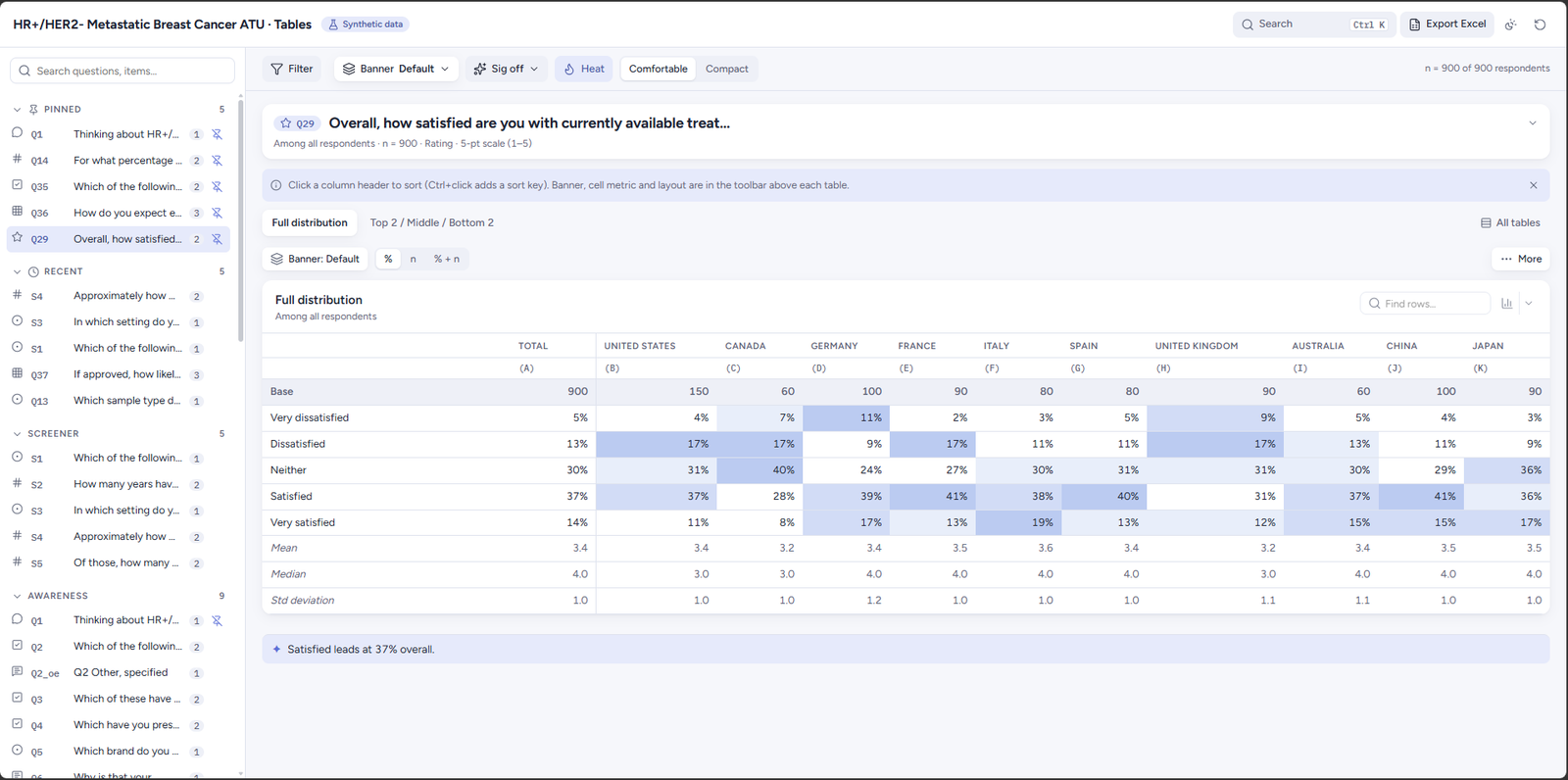
2. Cut the data your own way. Choose how the columns are split, for example by country, and add filters such as specialty or practice setting. Every table recalculates instantly. You don’t need to send a request or wait for a new file.
3. The base is always clear. The brand funnel shows why this matters. Awareness (Q2) is asked of all respondents. “Ever prescribed” (Q3) is only among those aware of each brand. “Prescribed in the past 3 months” (Q4) is only among those who have ever prescribed it. Each table states who it is based on. Small bases are flagged automatically: a warning appears below 30 respondents, and results are hidden below 10.
4. Significance testing that explains itself. Statistically significant differences are marked on every table at 95% confidence, with a plain-language note explaining what the letters mean. Testing can be switched off for a cleaner read.
5. Complex questions made readable.
- Brand-by-attribute grids (Q16: how well each brand performs on each attribute) can be viewed as average scores, top-2-box percentages, or one attribute at a time. In Excel, that is usually a dozen separate tabs.
- Net Promoter Score (Q28) shows promoters, passives, detractors and the final score in one place.
- Rankings (Q24–Q25, top influences and unmet needs) show the share ranking each item in the top 3 and its average rank.
- Patient share by line of therapy (Q9–Q11) shows how physicians split their first-, second- and third-line patients across treatment approaches.
-
6. Hear the doctors’ own words. Open-ended answers sit next to the numbers and can be searched, for example why physicians prefer their most-prescribed brand (Q6), a recent switch they made (Q32), and the biggest unmet need they still face (Q43).
7. From table to slide in one click. Any table can be turned into a chart, copied straight into a report, or saved as an image. The full table set, or just the view you have built, can be exported to a formatted Excel workbook. The numbers in Excel match the numbers on screen exactly.
8. Nothing to install, no logins. The whole study is one file. It opens in any modern browser, works offline, and can be shared through your usual secure channels like any other deliverable. Your data stays in that file and isn’t uploaded to an outside platform.