The November 2024 update for Power BI is packed with features, from AI enhancements to new visualisations and improved modelling tools. Let’s explore some of the key highlights:
Copilot
Copilot Takes Centre Stage: AI on the Go and in Your Inbox
Microsoft is continuing to integrate AI into Power BI, and this update brings two exciting new Copilot features.
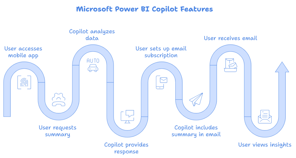
First up, Copilot is now available in Power BI mobile apps. Imagine being able to ask your phone for a quick summary of sales performance or to identify key insights from a complex report – all while you’re on the move. That’s precisely what this feature enables. Users can simply tap the Copilot button within a report on their mobile device and request a summary or insights. Copilot will then analyse the data and provide a tailored response.
The second Copilot enhancement is the ability to receive AI-powered summaries in your email subscriptions. This means you can stay up-to-date with key insights from your reports without even opening Power BI. When setting up a standard email subscription for a report, users now have the option to include a Copilot summary, which will be delivered alongside an image of the report.
Reporting
Reporting: Visualising Paths, Simplifying Data Exploration, and More
Path Layer
The Azure Maps visual now boasts a new Path Layer, allowing users to visualise connections between multiple geographic points. This is particularly valuable for businesses that need to analyse routes or track movements across locations. For instance, a logistics company could use this feature to visualise delivery routes and identify potential areas for optimisation.
Text Slicers
Data exploration is also getting easier with the introduction of the new text slicer visual. This visual allows users to filter data simply by typing in specific text, making it much simpler to find the information they need, especially when dealing with large datasets.
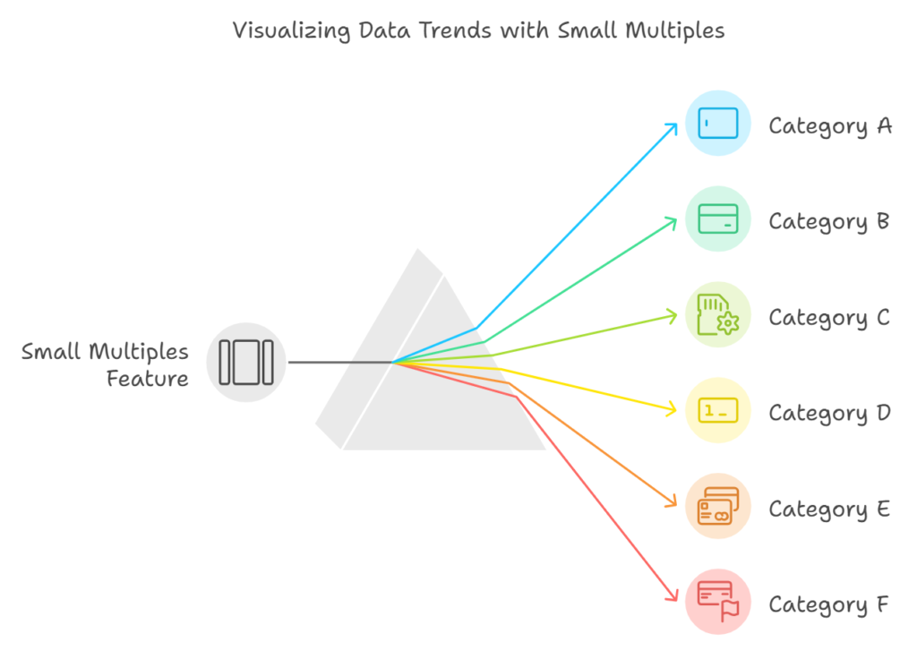
Small Multiples (New)
Another notable addition is the Small multiples feature for the new card visual. Small multiples allow users to display a series of cards, each representing a different category or dimension of data, within a single visual. This makes it easier to compare data across different segments and identify trends or patterns.
Modeling
Modelling: Efficiency, Security, and Developer-Friendly Enhancements
Microsoft has introduced several improvements to Power BI’s modelling capabilities, aimed at enhancing efficiency, security, and the overall developer experience.
One notable enhancement is the ability to quickly define new measures directly within the DAX query view. This simplifies the process of creating query-scoped measures, saving developers time and effort.
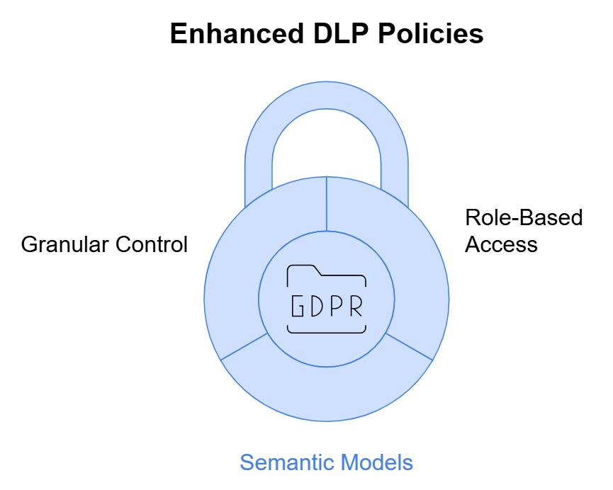
Enhanced Security
Security gets a boost with updates to DLP (Data Loss Prevention) policies. Administrators can now restrict access to sensitive data within semantic models based on user roles and the type of sensitive information detected. This provides a more granular level of control over data access, strengthening security and compliance.
For Power BI developers working with semantic models, Microsoft has released a new TMDL extension for Visual Studio Code. This extension provides several features that streamline development, including semantic highlighting, error diagnostics, and autocompletion. It also integrates seamlessly with Git for source control management.
Data Connectivity
The Snowflake connector has been updated to provide more context in queries sent to Snowflake. This includes information about the source of the query, such as whether it originated from Direct Query. This enhancement provides greater transparency into query execution and can assist with troubleshooting.
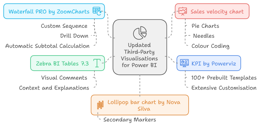
Third Party Visualizations
Several third-party visualisations have been updated, adding further versatility and analytical capabilities to Power BI.
● KPI by Powerviz offers over 100 prebuilt KPI templates and extensive customisation options, making it easy to create visually appealing and insightful KPI dashboards.
● Zebra BI Tables 7.3 introduces a rich text editor for visual comments, enabling users to add context and explanations directly within reports.
● Waterfall PRO by ZoomCharts provides an interactive waterfall chart with features such as custom sequence, drill down, and automatic subtotal calculation, making it ideal for financial analysis.
● Lollipop bar chart by Nova Silva now includes secondary markers, adding another layer of data to the visualisations.
● Sales velocity chart combines pie charts, needles, and colour coding to visualise product sales and profitability across different countries.